Every great product starts with a conversation, not a canvas.
When clients come to me, they usually have one of two things — a big idea with no direction, or a half-built product that isn’t working. Either way, the solution is never to open Figma immediately. It’s to listen first.
My process runs on four stages: Discovery, Strategy, Execution, and Refinement. Each one is non-negotiable, and skipping any of them is where projects fall apart.
Discovery is where I ask the uncomfortable questions. Who is this actually for? What does success look like in 6 months? What does the current experience feel like and why does it fail? I spend real time here — not a 20-minute onboarding call, but deep conversations that surface the real problem, which is almost never the one the client described.
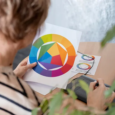
Strategy is where the design thinking begins before a single pixel moves. I map user flows, define the information architecture, and establish the visual language. Color, typography, spacing — these aren’t decorations, they’re decisions that carry meaning. A font choice communicates authority or approachability. A color palette signals trust or urgency. Getting these right at the strategy stage means execution moves fast and confidently.
Execution is where the work becomes visible. Wireframes first, always. Low fidelity before high fidelity. I show clients the skeleton before the skin, because changing a wireframe takes minutes and changing a finished UI takes hours. From wireframes I move into high-fidelity design in Figma — building components, designing states, documenting the system so that handoff to developers is clean and nothing gets lost in translation.
Refinement is the stage most designers skip because clients think the job is done when the screens look finished. It isn’t. Real refinement means testing the design against actual users, watching where they hesitate, identifying what confuses them, and fixing it without ego. The best design decisions I’ve ever made came from watching someone use a product and noticing what I got wrong.
Four stages. Every project. No shortcuts.