Edtech UX design for K–12 products has to serve two audiences with different priorities — students need clarity and engagement, while parents want transparency, trust, and measurable progress. Wise Wings Education needed an interface that worked for both without creating friction between discovery, enrollment, and learning progress, despite inconsistent UI patterns, a seven-step enrollment process, weak progress tracking, and a desktop-first experience serving an audience that was 78% mobile.
Parent and student journeys were separated into distinct navigation structures within one unified system, enrollment was cut from seven steps to three, and a 60+ element component library replaced inconsistent patterns with a mobile-first, milestone-based progress experience. Enrollment completion rose from 35% to 71%, session duration increased, and mobile usability scores improved.
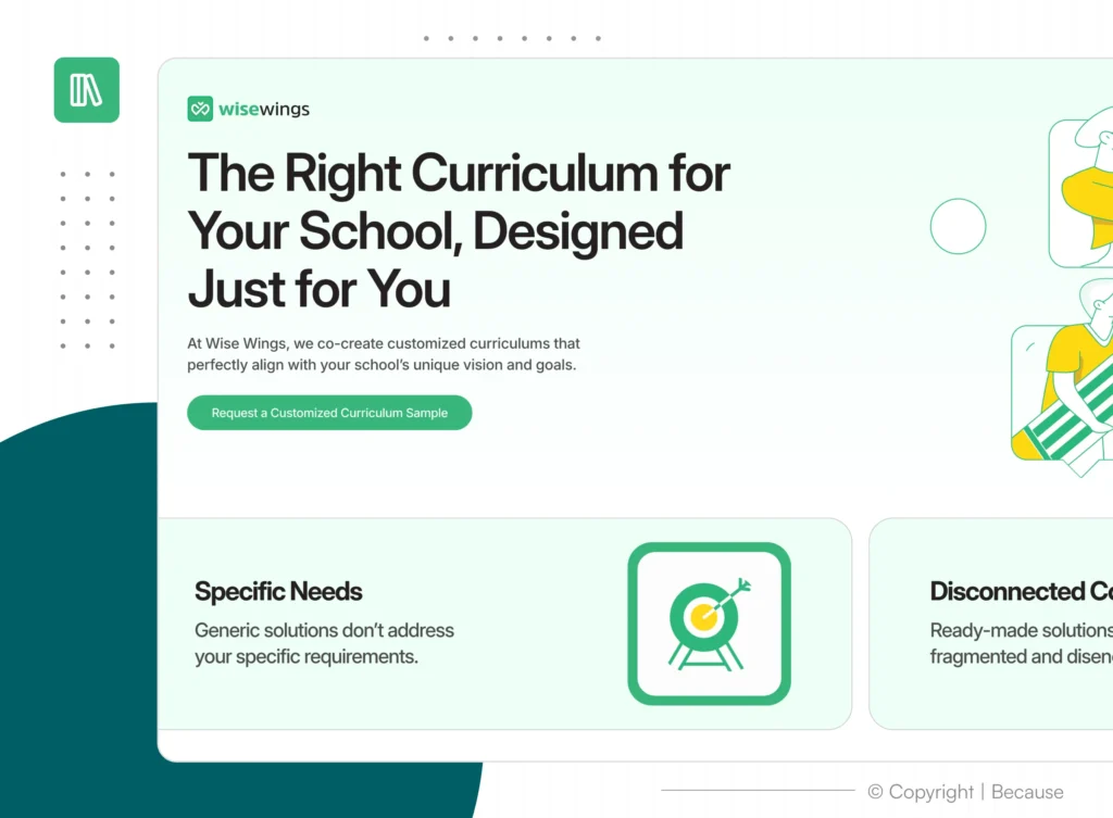
• THE DELIVERABLES
A System Built From Two Mental Models
- User Research
- Information Architecture
- Wireframes
- UI Design
- Component Library
- Prototype
- Usability Testing
KEY TAKEAWAY
The most valuable decision wasn’t visual — it was restructuring the information architecture around distinct parent and student mental models.
Once navigation aligned with user expectations, the rest of the interface became simpler, clearer, and more effective. Strong edtech UX design isn’t about making interfaces look better — it’s about removing friction where learning, trust, and motivation matter most.