Noosom asked a harder question than most lifestyle products do: how do you design an interface for someone’s life story — and what happens when you realize the interface has started competing with it? This case study covers two chapters of Noosom. The first is the brand design, website, and product interface I designed and shipped over three years. The second is a full visual lifestyle brand design, I designed after launch, once I concluded the original system no longer matched the trust and restraint the product deserved.
The rebrand was fully designed and documented. Mission Software, the development partner, chose to keep the existing interface instead. What follows is both — the shipped work and the proposal that never went live, and the thinking that connects them.
• THE OVERVIEW
Memories, Not Tasks
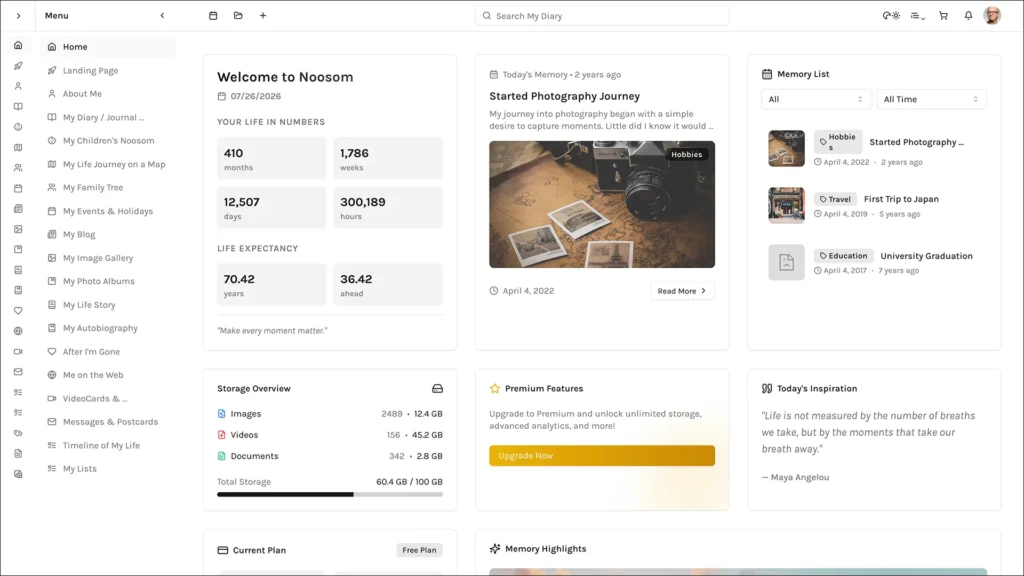
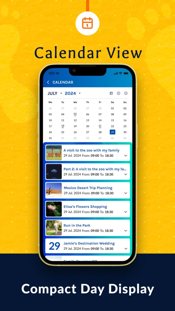
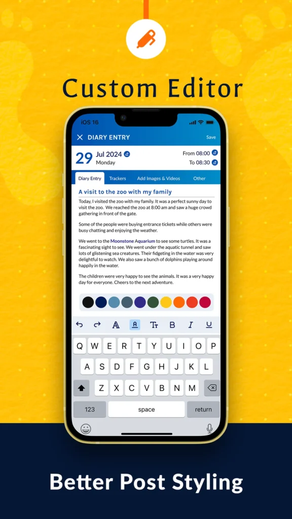
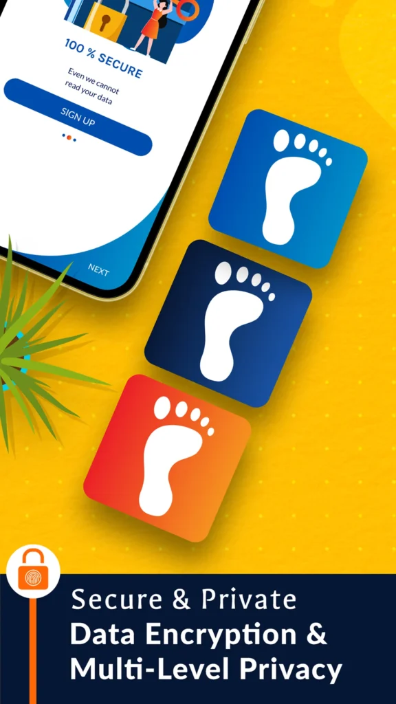
Noosom is a private digital diary — encrypted journaling, multimedia storytelling, and long-term archiving built for memories, not tasks. Users weren’t managing projects. They were documenting relationships, milestones, and family histories meant to outlast them.
I joined as a graphic designer. Three years later I was shaping UI, web, design systems, and brand direction across every customer-facing surface of the product.
Who are the Users & Key Stakeholders?
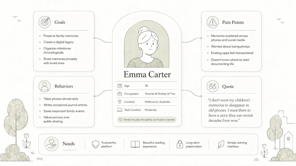
Noosom’s users weren’t professionals managing tasks — they were individuals and families preserving something personal: relationships, milestones, and histories meant to be read again in ten, twenty, fifty years. That changed the design brief entirely. Every choice had to earn trust with someone entrusting the product with their life story, not just their to-do list.
On the stakeholder side, I worked alongside Noosom’s founding team, who owned the product vision and direction, and Mission Software, the development partner responsible for building and maintaining the platform — and the party who ultimately decided the rebrand wouldn’t move into production.
• THE CHALLENGES
What are the Challenges we faced?
Software that holds someone’s memories carries a different weight than a productivity tool. The interface needed to feel calm and reassuring without feeling cold or clinical. The original design hit the brief and shipped successfully — but time with the product surfaced a gap between how it looked and how it should have felt.
Privacy
Trust
Permanence
Emotional Warmth
• THE SOLUTIONS
What solutions did we Draft?
The rebrand wasn’t a visual refresh — it was a correction, putting users’ memories back at the center of the screen instead of the interface itself. Without touching the underlying product structure, the proposal covered:
- Simplified color palette
- Rebuilt typographic hierarchy
- Consistent spacing principles
- Standardized reusable components
- Product and marketing aligned under one system
- A calmer, more trustworthy visual tone
See it in action—explore the interactive prototype on the right in fullscreen mode.
What Process did we Follow?
Every phase of the rebrand ran through the same four stages, applied to a system rather than a single screen.
The system itself was built on discipline, not decoration: a functional color palette with semantic roles, a consistent type scale, spacing tokens, reusable component patterns, unified iconography, and shared UI behavior across web and product — less cognitive load, more clarity, and a system that scales without re-litigating decisions screen by screen.
AI-Assisted Exploration
AI accelerated the exploratory phase — color directions, moodboards, brand variations — so more time went into judging ideas instead of producing them. Every decision on hierarchy, typography, and interaction was still made and refined the traditional way. AI compressed the breadth of exploration; it didn’t make the calls.
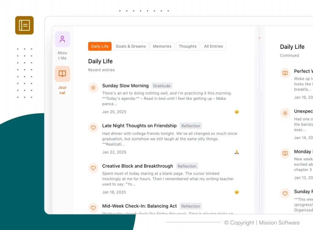
What was the outcome & Impact?
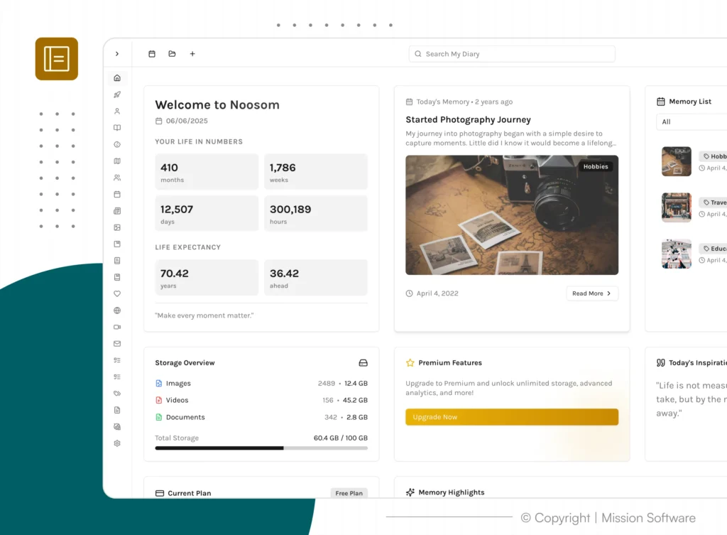
The rebrand was completed, documented, and presented. Mission Software chose to continue with the original interface — the new system never shipped. It remains one of the most formative pieces of work in my career, not despite going unshipped, but because of what building it required: recognizing when work I’d already delivered needed to be challenged, and having the case to back that up.
See it in action—explore the prototype below of our first rebranded draft in fullscreen mode.
What did I learn from this project?
Noosom changed how I measure the job. Early on, success meant screens that satisfied a brief. By the end, it meant stepping back from my own decisions and being willing to redesign something I’d already shipped.
Strong systems aren’t built by adding more visual expression — they’re built by removing what doesn’t need to be there until clarity and trust take no effort at all.
• KEY TAKEAWAY
The most valuable work you produce isn’t always the version that ships.
This isn’t a product case study. It’s about continuous observation, refinement, and unrealized potential.